Hill Colouring on the Cycle Map
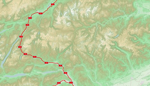
Last week, in amongst a bit of a hosting problem, hill colouring went live on the cycle map. And it looks awesome!
Having something more pleasing than a flat grey background really helps put flesh on the skeleton of the contour lines, but it means that some stuff needs tweaking to fit. You can see the lovely new forest and wood styles on the image below - my very own forest pattern symbol, with a subtle green tinge and a solid border. The same area before can be found (here).
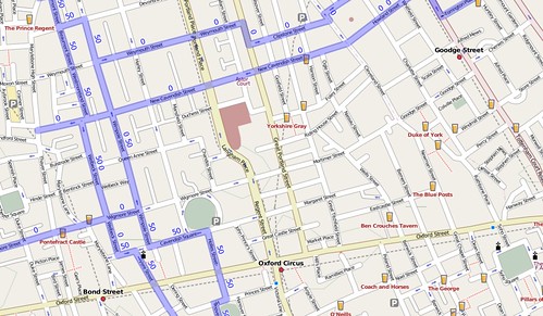
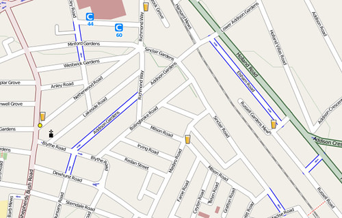
But wait - there’s more! In city centres, cycle routes can get quite complicated, and in some places have to go down one-way roads. You then end up with links that are only supposed to be followed in one direction - if you go the other way you might end up facing a no-entry sign (that you’re not really supposed to blithely ignore, politicians too for that matter). So you might end up with a confusing array of cycle routes, such as in central London:
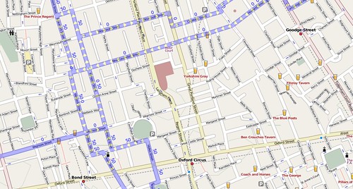
… but no longer. The swiss-army-knife-like ‘relations’ to the rescue, which can give pointers as to which way you’re supposed to go. That gives us …
(Click the pictures for more detailed loveliness!)
But wait, that’s not all. Maybe your area doesn’t have any signed cycle routes and no cycle paths either. Or maybe you’ve got both, and also want cycle lanes marked. A nice little bit of blue casing on either side of the road shows which streets have cycle lanes.
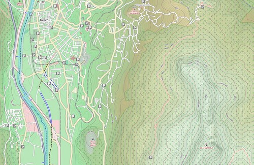
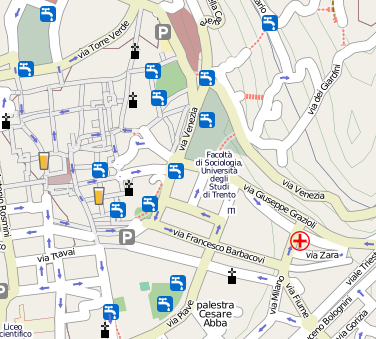
And finally, the icon wizardry of Matt Amos has helped me out with showing more useful points of interest - we now have drinking water locations shown (here in Trento, Italy):
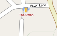
… which are probably a better idea than going to a pub. But what’s better than going to a pub for a nice refreshing beer? Well a pub with free wifi, of course!
And there’s been a million and one places added to the cycle map too, but far, far too many for me to list here. Enjoy!
This post was posted on 17 August 2008 and tagged OpenStreetMap
